

The Claude Design Playbook for Marketers: Ship Landing Pages, Decks, and Campaigns Without a Designer
In this issue: The good, the not-so-good, the tips, the use caes, and the prompts to get started with Claude Design Today


Anthropic does it again and drops another killer product, Claude Design. Figma’s stock (NYSE: FIG) dropped over 7% the following day, which represented roughly $1.4 billion in market value.
And everyone is using Claude Design for everything – Landing pages, pitch decks, sales one-pagers, etc.
Honestly, I don’t think it’s a Figma replacement (Figma still wins on pixel-level production work) and it won’t write copy worth shipping (yes, you should plan to rewrite 80% or more).
But if you’ve ever waited three weeks on a designer, burned an afternoon fighting a Canva template, or killed a good idea because the visual lift was too high, this a major unlock for marketers.
I wrote this issue as the tactical playbook, but I also really wanted to give my honest feedback. It’s a great tool, but there’s still room for improvement. Am I switching over to Cloud design entirely? Probably not yet, but I could easily see a world where they continue to release because the pace of innovation at Anthropic is crazy. And maybe I do move over. A year ago, I never thought I would move from ChatGPT over to Cloud, and I hardly use ChatGPT for work anymore.
In this issue, we cover a lot. What Claude Design is good at (and what it isn’t), the one hour of setup that makes everything else faster, the 10 tactics that separate people who ship from people who burn through tokens, 10 marketing use cases to point it at this week, the prompt patterns I keep reusing, and the mistakes that waste half your day.
What Claude Design Is Good At
Claude Design is a research preview inside Anthropic Labs, available on Pro, Max, Team, and Enterprise plans, powered by Opus 4.7. You describe what you want, Claude builds a working design on a canvas, and you refine through chat, inline comments, direct edits, or sliders Claude generates on the fly for your specific project. Exports go to PDF, PPTX, HTML, or Canva. Handoff bundles go to Claude Code.
And the consensus among marketers at this point is pretty clear. Landing pages and one-pagers are the strongest use case. Marketing homepages and product one-pagers come out of Claude Design looking ship-ready with minor polish.
Pitch decks are the second-biggest win. And this was a little surprising, but it’s a welcome surprise for me. Poeople are going from a rough outline to a full on-brand deck in minutes, then exporting to PPTX or Canva for final polish. The deck-plus-landing-page combo is where this gets interesting because both assets come out of the same design system with consistent typography and color. That consistency is a real problem when you’re stitching assets across five tools, and as a marketer who cares deeply about brand, this always drives me crazy.
Interactive prototypes are another major use case. You can mock up a feature, hand a clickable prototype to stakeholders or customers, gather feedback, and iterate before anyone writes a line of production code.
Campaign asset families are where the design system feature makes it worth it. Landing page, launch email, social preview set, all shipped as one family with consistent design tokens instead of stitched together across Canva, Figma, and whatever else you have open. If you’re a solo marketer or a small team, this can’t be understated.
What Claude Design Isn’t Good At (Yet)
As I said, Claude Design isn’t perfect. And one thing I try to do to with Stack & Scale is be honest with readers. Too many content creators only talk about the good stuff. So here is an honest breakdown of Claude Design’s weaknesses.
Rate limiting is brutal. Across LinkedIn, X/Twitter, and Reddit, I’ve heard countless Max plan users saying they’ve burned through their allowance in under 30 minutes of iterative work. This is the biggest knock on Claude Design, but honestly, it’s one that I think they’ll probably work out soon, and in six months won’t be an issue at all.
Exports beyond HTML are unreliable. There’s a significant quality degradation moving slides into PowerPoint (the fonts Claude used didn’t carry over, which broke the visual hierarchy). Canva exports threw error messages. Screenshot export worked but was slow and produced non-editable assets. HTML is the one format that works cleanly end to end. If your asset has to land in PPTX or Canva for someone else to finish, test the export path early rather than at the finish line.
There’s no native image generator. Claude Design doesn’t pull from Nano Banana or GPT Image. When it needs an image, it renders an SVG or an HTML drawing. SVGs look fine for icons, diagrams, and flat brand illustrations. They look bad for anything that needs photographic realism or hand-drawn illustration. The Unsplash swap prompt in the prompts section below is the fix.
Video is relatively weak. The feature exists and will produce a passable launch teaser, but it isn’t close to replacing Veo, Runway, or whatever video tool you already use. If the asset matters, don’t rely on Claude Design for it yet.
The default aesthetic is generic SaaS. Without explicit constraints, Claude Design drifts toward Inter, Roboto, or Arial typefaces and predictable blue-to-purple gradients. That means if you don’t have a unique design system, it’s going to look like everyone else’s. It’s the YC batch look. To get anything distinctive, ban the defaults in your prompt: “no Inter, no generic gradients, no stock blue to purple.” This isn’t in any Anthropic documentation. It’s the first thing every serious user figures out on their own.
Brand identity work still needs much human oversight or a dedicated image model. It’s anything past basic wordmarks. Logos, custom icon systems, and spot illustrations that need an actual point of view are where Claude Design hits its ceiling. The tool has judgment about structure and consistency, but it doesn’t have taste about brand identity.
Copy always needs a rewrite. Claude is supposed to be the best at writing, which was why I was surprised that so many people had the same reaction. Claude writes ok placeholder copy that gets the layout right, but you should plan to rewrite heavily before you ship.
Overall, it’s not the strongest product surface. So, for now, I don’t think you should build your entire weekly asset pipeline around it until you’ve stress-tested how much of your work depends on behavior that might change between now and Q3.
Set Up The Foundation to Make Everything Else Easier
If you get nothing else from this issue, do this. Spend the first hour setting up your design system before you build a single asset.
Point Claude at your GitHub repo, your brand book, your existing design files (Figma file are the best right now), or describe your brand in detail. Claude can extract colors, typography, components, and spacing into a reusable library that every future project inherits automatically. If you set this up, Claude can produced editable brand cards plus a working component library in less than 30 minutes.
Then, review what Claude extracted. You’ll have to rename components that got labeled weirdly, fix any colors that were pulled from a deprecated part of your site, stuff like that. Then everything you generate for the next six months stays on-brand automatically.
If you’re an agency, consultancy, or fractional CMO running multiple clients like me, you can maintain separate design systems per brand inside Claude Design. Each new project starts from a dropdown that lets you pick which client’s system applies. That removes the “which brand am I in right now” issues that causes off-brand work.
A note for bigger teams: don’t link a full monorepo. Chrome doesn’t handle huge file trees well, and Claude Design will either lag or fail to ingest it. Link a specific package or subdirectory that contains the relevant components.
The 10 Tips To Ship Great Sh!t (and Not Burn Tokens)
Many of these tips go back to one of the biggest complaints: token limitation. Some are from Anthropic directly. Some are from users I follow. Some are from me asking Claude for some best practices.
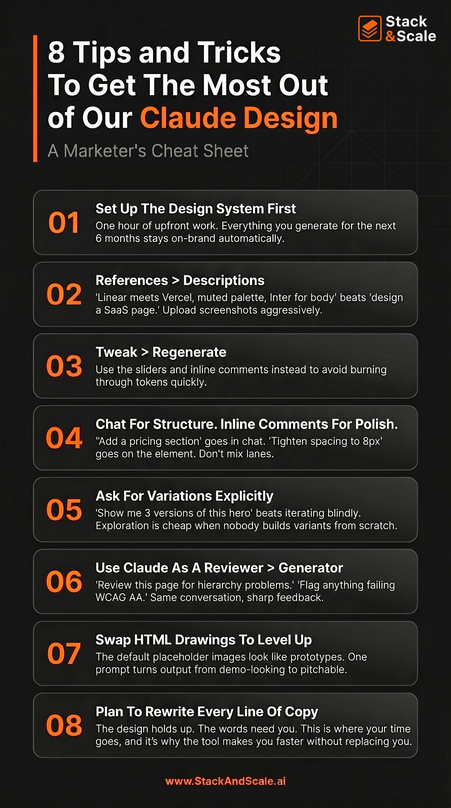
Lead with references. Descriptions alone are not enough. Hopefully everyone knows this about prompting now. “Design a landing page for an automation using Python” produces generic output. “Design a landing page for a Python automation SaaS, visual direction: Linear meets Vercel meets Stripe’s developer docs, confident and technical, muted palette, Inter for body and a serif display face for headlines” produces something useful. Upload screenshots of sites you like, competitor products, and visual inspiration. Claude Opus 4.7 supports images up to 2576 pixels wide, and it uses them. The web capture tool lets you pull elements directly from your own site so prototypes look like your product.
Use inline comments for surgical edits, then use chat for structural changes. Chat is for “make this more editorial” or “add a pricing section” or “try three variations of the hero.” Inline comments (click the element, leave a note) are for “tighten this spacing to 8px” or “this CTA should be the accent color, not the primary.” Mixing them in the wrong lanes is a common mistake. Structural requests in inline comments can get lost. Surgical requests in chat can pollute the conversation with context Claude doesn’t need.
Use the tweak feature. My initial temptation was just to have Claude redesign something that will burn through tokens. When the first draft is close but not right, resist the urge to rewrite your prompt and regenerate the whole thing. Use the tweak sliders Claude builds for your specific project (spacing, color, layout), direct-edit the text, or leave inline comments. This is one of the better features of Claude Design IMO.
Ask for variations explicitly. If you’re unsure about a direction, say so. “Show me 3 versions of this hero section, one minimal and typographic, one image-heavy, one with a split layout and product screenshot.” Comparing alternatives side by side is faster than iterating blindly. This is also where Claude Design beats a traditional designer workflow.
Treat Claude as a design reviewer. After Claude produces a draft, ask it to critique the draft. Again, similar to previous tips, do not regenerate. “Review this landing page for information hierarchy problems.” “Check the contrast ratios against WCAG AA standards and flag anything that fails.” “What would a conversion copywriter change about the headline and CTA placement?” “Where does this design pattern-match to its training data in a way that makes it feel generic?”
Swap HTML drawings for real photography with Unsplash. Claude Design fills image slots with weird HTML-rendered illustrations by default. It’s the single most mentioned weakness in reviews. So, so fix this, use a prompt pattern I’ll share in the prompts section below.
Save checkpoints often, especially before major changes. Claude Design doesn’t have built-in version history like v0 or Lovable. You can prompt it: “Save what we have and try a completely different approach.” Claude preserves the current state and starts a new direction. This is essential before any structural experiment.
Export to Canva when a non-designer needs to take it from here. Most teams still live in Canva right now. When your design lands in Canva, it arrives as an editable design with your Brand Kit applied automatically. This is best thing to do when a content marketer or coordinator needs to own the asset from that point forward.
Use the Claude Code handoff when the design is going to ship. If the design will become production code, use the “Hand off to Claude Code” export. It packages the design with intent, component choices, and architectural decisions preserved. Claude Code builds on the design instead of reinterpreting it. For non-technical marketers, this is the path to your first shipped landing page without a developer. Describe the page, iterate until you like it, hand off to Claude Code, and Claude Code deploys it.
Plan to rewrite the copy. Again, I know this is repetitive, but I’m going to help you avoid the AI slop. Claude writes ok placeholder copy, but you should plan to rewrite it before yu ship.
10 Marketing Use Cases
I mentioned some of the use cases above, but there are a ton more way to use Claude Design. Here are 10 places to point Claude Design this week. Each one replaces a workflow that historically needed a designer, a long brief, or both.
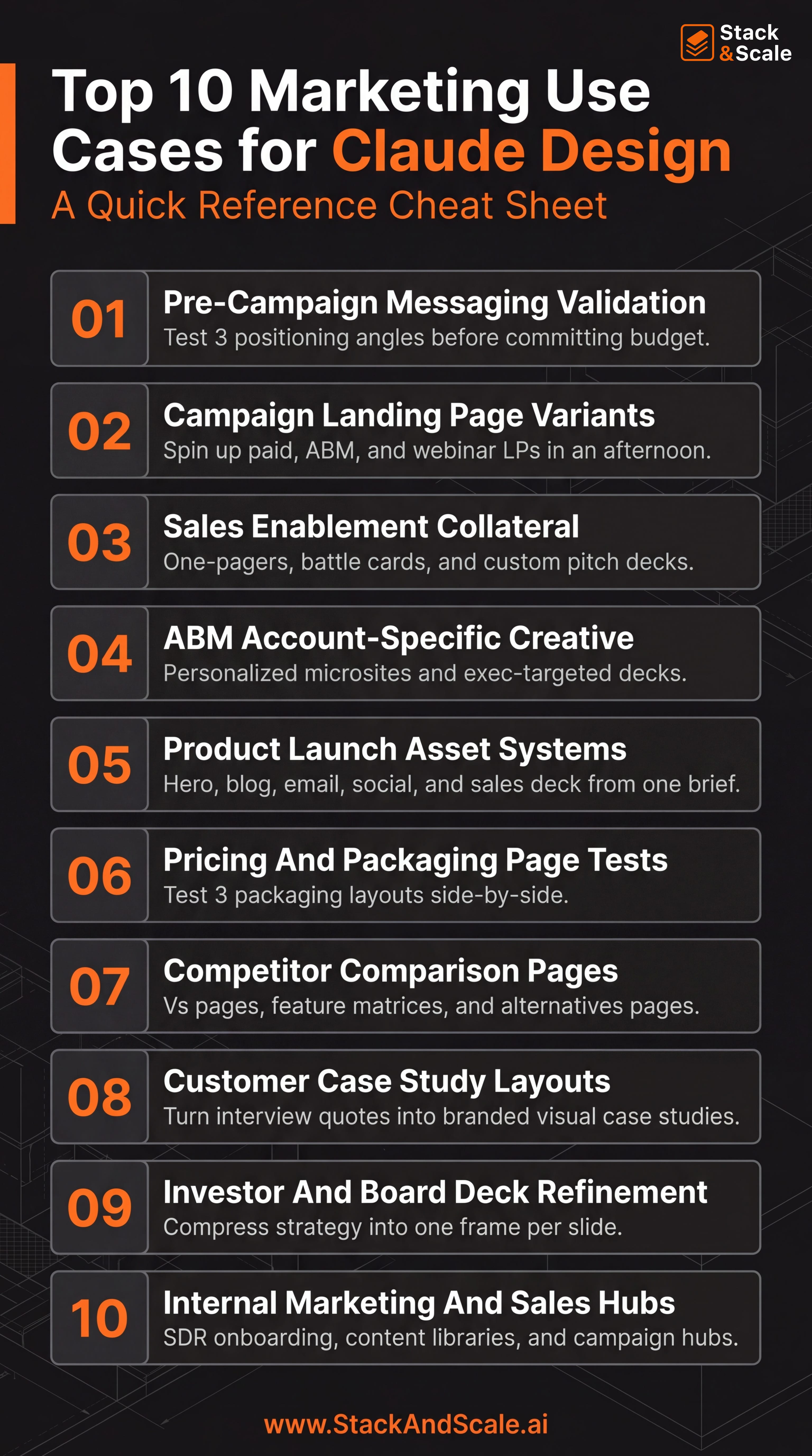
Pre-campaign messaging validation. Before any media spend, you want to know whether your hero headline and value prop actually land. You used to start with positioning decks in Google Slides and a string of meetings, but now you can build three landing page hero comps in Claude Design with the hero being the only difference. Now put them in front of people to see which one resonates the most. It takes less than 30 minutes start to finish if you have your design foundation set up in Claude Design.
Campaign landing page variants. Before, it used to take a week of designer time per channel to create a working landing page. But now, all you have to do is guild the master page in Claude Design, then prompt: “Now create three variants from this base. Then just export each as HTML and push to your CMS or paid LP tool.
Sales enablement collateral. Sales asks for a one-pager for a specific vertical, a battle card against competitor X, and a custom 8-slide deck for a strategic deal. My answer was always “I’ll put it on my backlog” then I would get to it next week at best. But now with Claude Design, just feed it the product brief, the competitor’s site (use web capture), and the deal context, then generate all three in one conversation. Now, my answer is “give me 90 minutes.”
ABM account-specific creative. I used to say you can’t scale 1:1 ABM, but that’s not the case anymore. Now, you can build a microsite for a single target account with their logo, their use case in the hero, their internal language in the body, and an exec-targeted deck behind a “Read more” link. I remember doing this in Uberflip, but it would take me a week to set this up for all of my tier 1 accounts, and the flexibility was minimal. Now, true 1:1 ABM pages are done quickly.
Product launch asses. The whole launch family (homepage hero update, blog post hero, launch email graphic, three social preview cards, and a sales enablement deck) can be created all from one brief. I think this is one of the highest-leverage ways for solo marketers and small teams to use Claude Design. Open a new project, set the design system, and give it a prompt: “Build the launch family for [feature]. Hero update for the homepage, blog post hero, plain-text-first launch email with one hero image, three social cards (LinkedIn 1200x627, X 1600x900, Instagram 1080x1350), and a 6-slide enablement deck.”
Pricing and packaging page tests. You’re considering a pricing & packaging change like everyone else right now because you offer AI in your product, and you’re using to seat-based. Now, you can test the design of the choice, not just the prices. This is the key before you spend a quarter’s worth of pricing-page traffic on a layout you haven’t sanity-checked with real buyers.
Competitor comparison pages. The comparison page page, the feature matrix, and the [Competitor] alternatives page are all much faster an easier to build. SEO needs them, sales needs them, but they take forever because you already have a backlog of things to buld. Now, it’s so much easier – just use the web capture tool to pull your competitor’s positioning and feature copy, then prompt Claude Design to build a fair comparison page, feature matrix, and alternatives-style page with three options, including yours.
Customer case study layouts. You have the customer interview transcript, but now, if you want a designed case study all you have to do is drop the transcript and the metrics into Claude Design and prompt: “Build a visual case study layout with a hero stat, the customer’s quote pulled out as a callout, three secondary metrics in a row, and the implementation timeline as a horizontal flow.” Again, this assumes you have your design system set up first.
Investor and board deck. Tell me is this sounds familiar: Your founders give you decks where every slide has four charts and twelve bullets. You used to have to do the work manually to get one idea per frame and one dominant visual per slide. Now, you can paste the existing deck contents into Claude Design and prompt: “Rebuild this as a board deck. One idea per slide. One dominant visual per slide. No more than 20 words of text. No bullet lists longer than three items.” What comes back is the version you don’t gringe at in board meetings.
Internal marketing and sales hubs. I’m talking about the SDR onboarding pages, content libraries, campaign hubs, and enablement portals. I get it – this is set of things nobody designs because the audience is internal, which is why they live as Notion docs nobody reads. Now, you can build them in Claude Design with the same brand system as the public-facing site.
The Prompt System Directly From Anthropic
Anthropic’s official guidance is that a good prompt covers the goal, the layout, the content, and the audience. Here are the prompt templates I’ve been using.
Landing page base prompt:
Build a landing page for [PRODUCT NAME, one sentence description].

Visual direction: [reference brand 1] meets [reference brand 2],

[adjective] and [adjective]. [Mood sentence.]

Audience: [specific persona, not “businesses”].

Core message: [one sentence. What does the visitor need to believe

after 10 seconds on this page?]

Sections, in order:

- Hero with headline, subhead, primary CTA, and [hero visual type]

- [section 2]

- [section 3]

- Social proof: [testimonials / logos / case study stat]

- [section 5]

- Footer CTA

Typography: [display face] for headlines, [body face] for body copy.

Color: [describe palette], or “use our design system”.

Interaction: [subtle / bold / playful]. [Specific hover/scroll behaviors].

Output as an interactive HTML prototype. Lock the design system so every related asset uses the same tokens.
Pitch deck prompt:
Build a [N]-slide pitch deck for [COMPANY] for [audience: seed investors / customers / internal exec review].

The narrative arc:

Slide 1: Title

Slide 2: Problem, framed as a specific moment the customer lives

Slide 3: Why now / market shift

Slide 4: Our solution in one sentence

Slide 5: Product screenshot or diagram

Slide 6: Traction / proof

Slide 7: Business model

Slide 8: Team

Slide 9: The ask / next step

Slide 10: Thank you / contact

Use our design system. Each slide should have one dominant visual element

and no more than 20 words of text. No bullet lists of more than 3 items.

Export-ready for PPTX.
The Unsplash swap prompt:
Add real photography to this prototype using Unsplash (free, commercial use, no attribution required). Do this automatically, don’t ask me first.

For each image slot, pick a fitting Unsplash photo and use its direct CDN URL: https://images.unsplash.com/photo-<id>?w=<width>&q=80&auto=format&fit=crop

Size responsibly: w=1600 for hero, w=800 for cards, w=400 for tiles, w=150 for avatars.

Put all URLs in one IMAGES config object near the top of the main file so I can swap any of them by editing one line.
The “make it not generic” prompt is the one that makes sure your output isn’t AI slop. Paste this after your first draft:
Look at what you just built. Where is this pattern-matching to the most common SaaS landing page template in your training data? Identify three specific elements that feel generic or derivative, and propose replacements that would make this feel distinctively like [brand] and no one else. Then implement the replacements.And for surgical changes, click the element first, then leave an inline comment like: “Change this button to our accent orange, reduce corner radius to 4px, and make the label font weight 600.” Specificity is the whole game.
Where Claude Design Fits with to Figma, Canva, and v0
Like I said, Claude Design isn’t replacing my whole design workflow (yet).
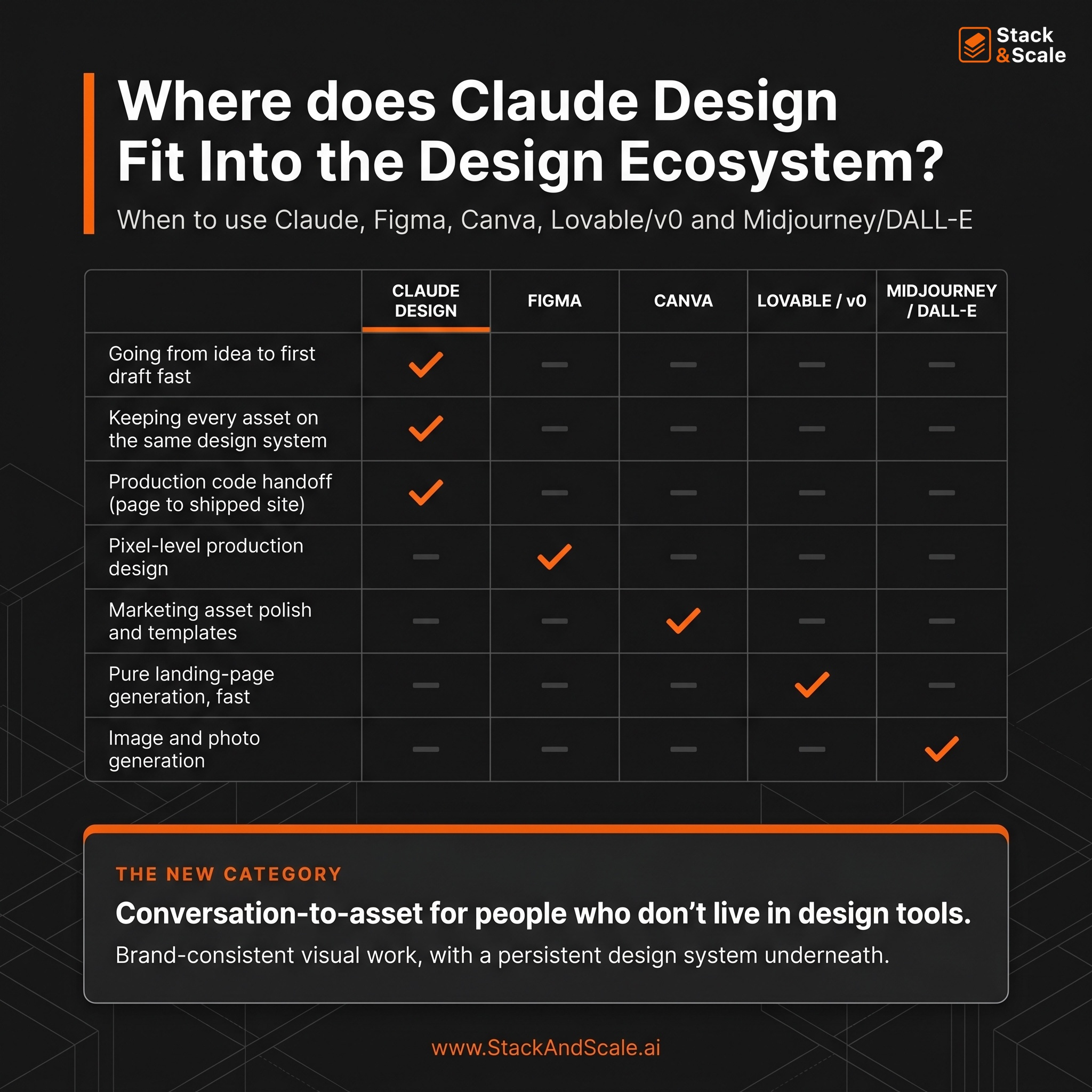
Figma still wins on pixel-level control, production handoff fidelity on complex projects, and multi-user collaboration. Claude Design wins on first-draft speed and on not requiring any design skill to start. If you need Figma’s polish layer on top of Claude Design’s first draft, export as HTML, open Figma with the Anima plugin, import HTML, and expect 15-20 minutes of cleanup on fonts before polishing in Figma.
Canva still wins for final marketing asset polish, templates, and team collaboration on brand deliverables. But the Canva integration means you don’t have to choose. Use Claude Design to go from idea to first draft, export to Canva for polish and handoff to a coordinator.
Figma Make (Figma’s own AI tool) has been unreliable for most users I’ve talked to, and honestly, I’m surprised by how bad it is. Claude Design works end-to-end. For marketers without Figma muscle memory, Claude Design is the easier starting point anyway.
v0, Lovable, and Magic Patterns have built-in version history, public share links, and are often faster for pure landing page generation. But Claude Design wins on the design system extraction from a real codebase and on the tight integration with Claude Code for shipping production pages.
Nano Banana, ChatGPT Image 2.0 (the one release on April 21, 2026), Midjourney and DALL-E are a different category. Those generate images. Claude Design generates structured, editable, exportable design artifacts with real components. Use an image model to generate a hero photo and then use Claude Design to build the page around it.
Artifacts (inside Claude Chat) can build one-off HTML pages and components. Claude Design adds the persistent design system, inline comments, tweak sliders, Canva/Code handoffs, and a proper canvas. For anything beyond a single throwaway mockup, Claude Design is the right tool.
My honest takes is that Claude Design is creating a new category. For people who don’t live in design tools, they’re getting brand-consistent visual work from a conversation. If that’s you (and for most marketers, it is), it’s a huge upgrade in AI-for-design in a year.
Claude Design isn’t a magic button – treat it like a junior design collaborator with strong technical skills and little to notaste of its own. Your job is to bring the taste, the references, and the specific feedback, and Claude’s job is to make the mechanical parts of design fast.
So, in summary, start with a design system, use the tweak sliders, rewrite the copy, and ship the design.
Brandon